Oasis: A Museum in the Landscape
Project Location
Riverside, CA
Client
La Sierra University
Area
40,000 SF
Services
Architecture, interiors, planning, exhibit coordination, programming, and structural design
Gateway to Campus
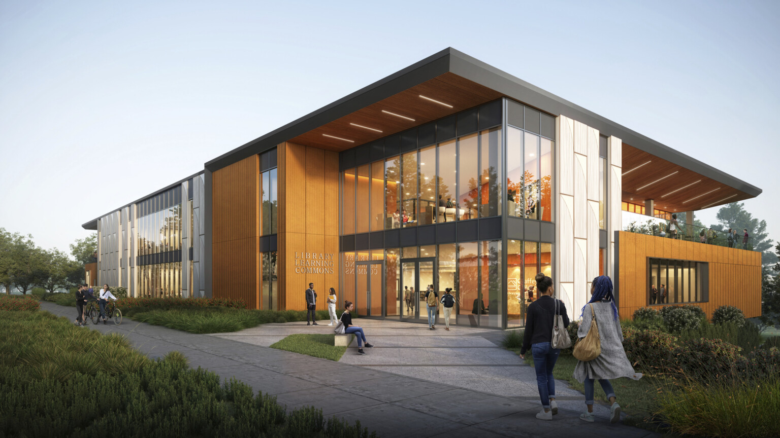
The La Sierra University campus is a tapestry of beautiful outdoor garden rooms connecting humble midcentury buildings through layers of dappled light, fountains, and lush landscapes all within a nationally registered arboretum. The gateway to the campus and to this landscape will be the new Museum and Visitor Center to orient prospective students, showcase research and collections, and provide current students with amenity spaces for study and reflection.
Connected Yet Tranquil
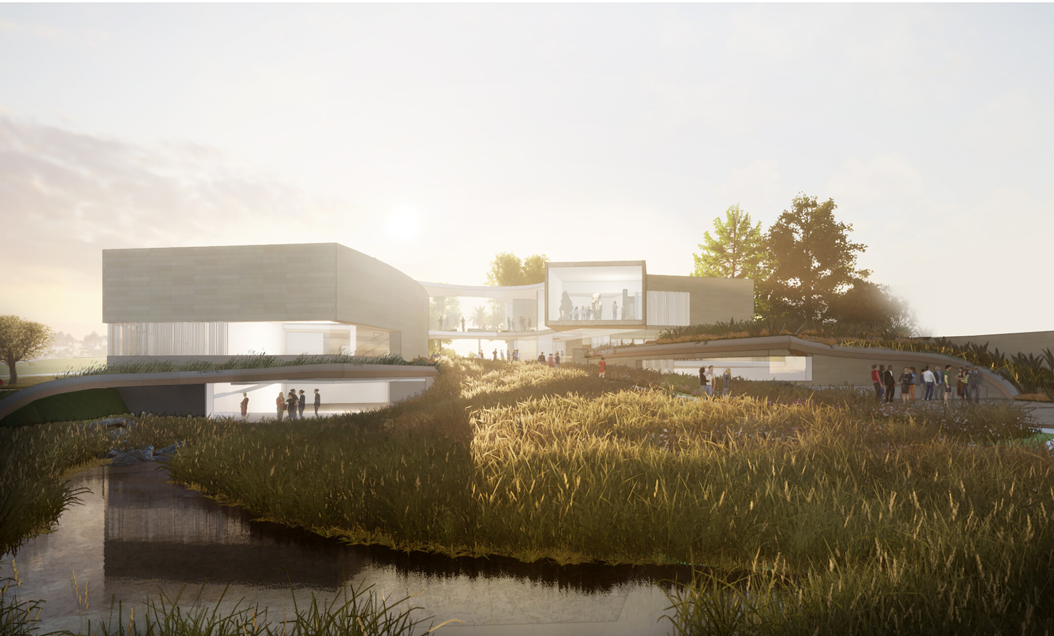
The Museum is first considered as an Oasis. The Oasis offers a connected yet tranquil experience throughout. Sweeping pathways and carved interior courtyard walls lead visitors throughout the site in an approachable manner. The two wings of the building create cascading courtyards with adjacent oasis landscape spaces. Certain moments connect, and others offer peaceful reflection. The lower building walls have a heaviness that expresses stone and the earth. At the same time, the upper structure is delicate and light, clearing the views of the flourishing desert Cienega below.
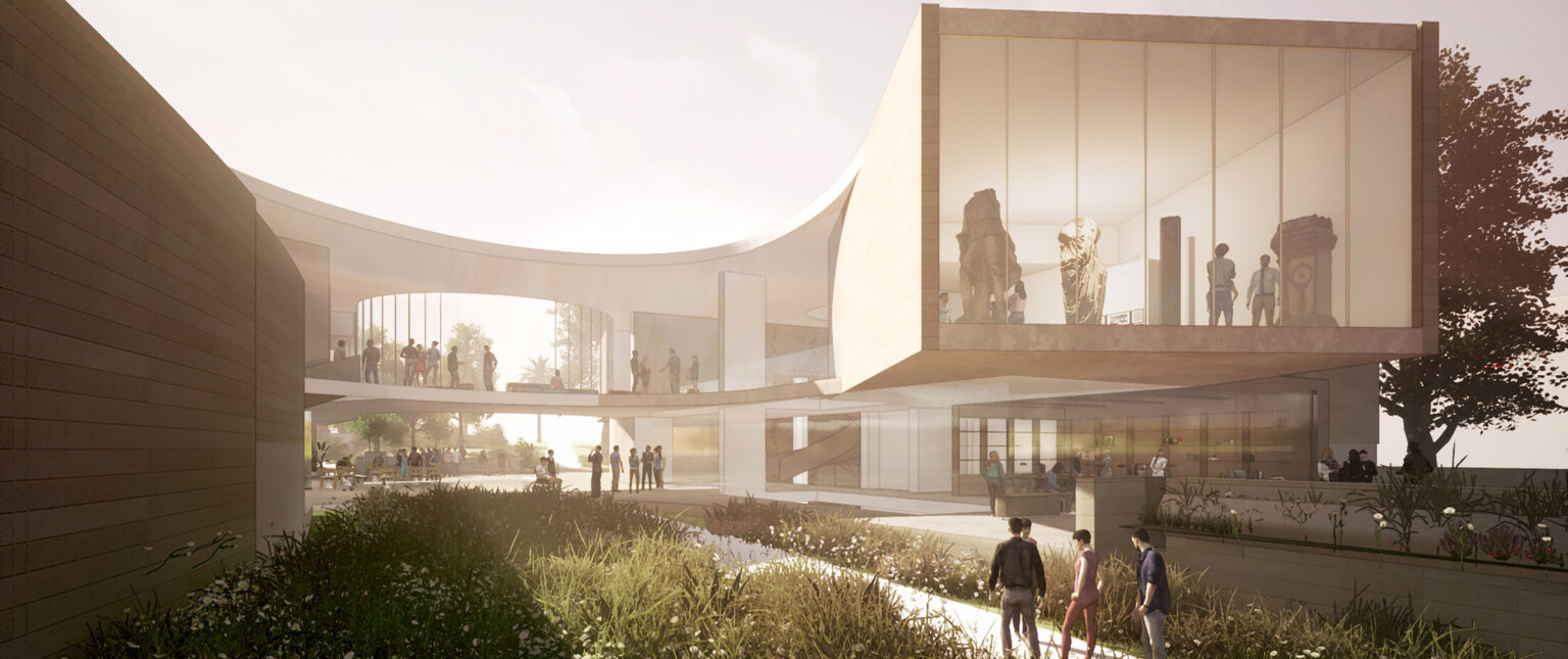
Connected to the Earth
Our approach to landscape design draws on the natural plant communities of the region and augments with plants adapted to the climate. The building is organized around the flow of the landscape and the natural water flowing through the site. While the building is deeply embedded into the earth, areas within the building shine as a beacon, welcoming visitors to this new iconic destination at La Sierra University.
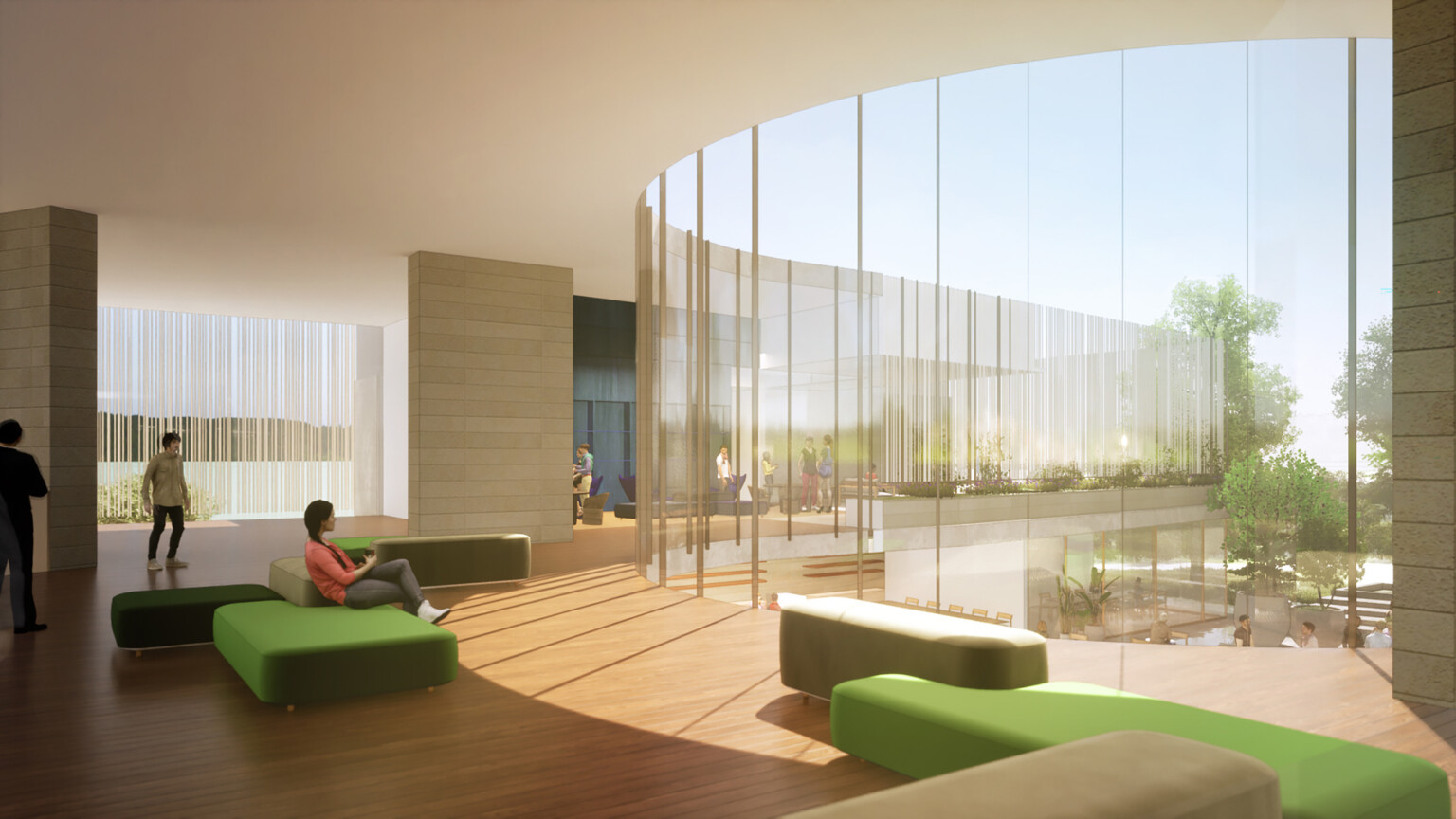
Rich Abundance of Plant Life
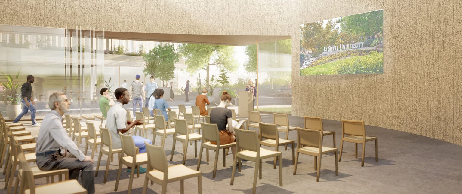
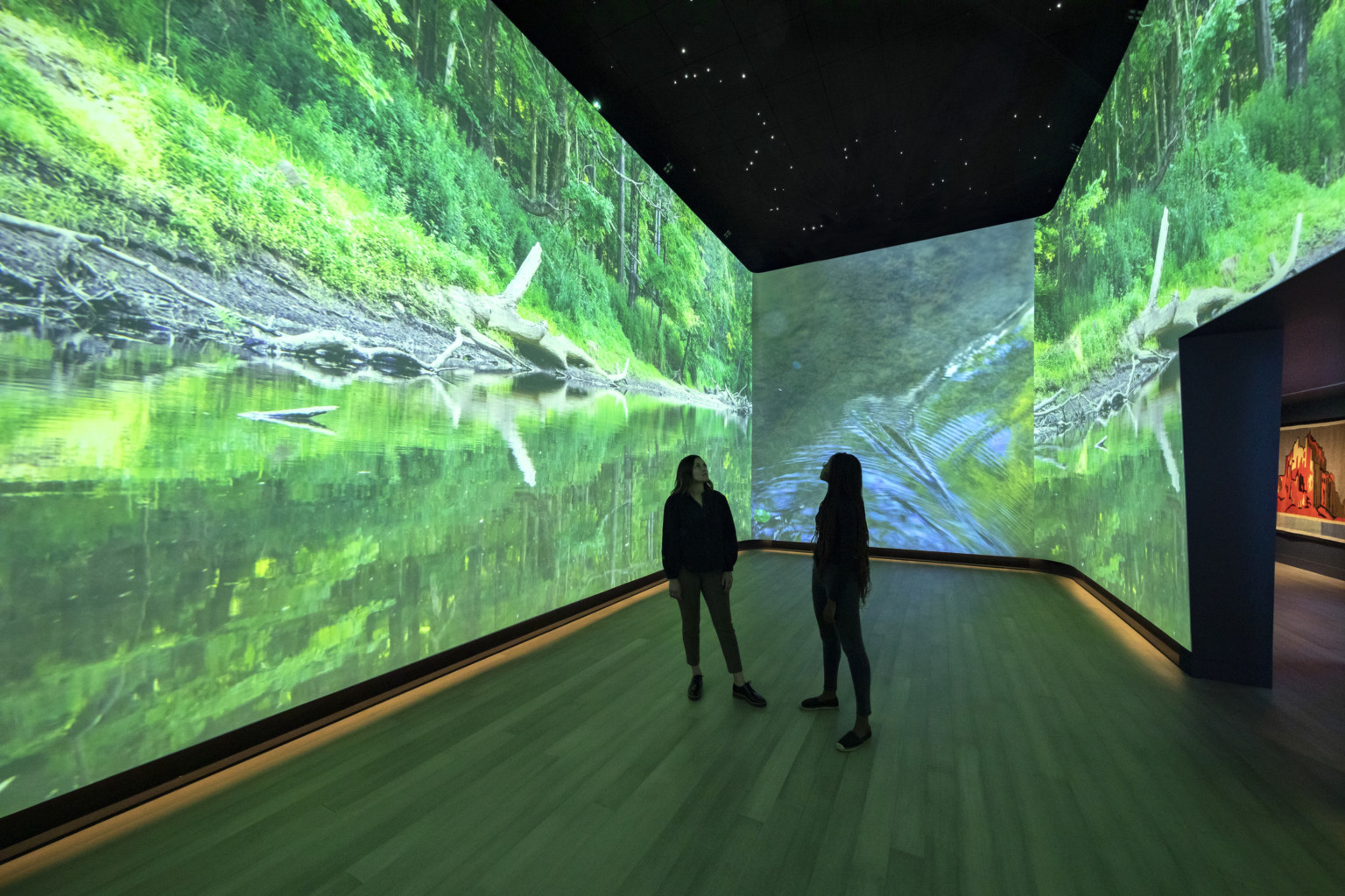
The shaded outdoor space, amphitheater seating, and adjacent cafe will draw students, faculty, and visitors alike and grow a new social heart of campus directly off the pedestrian thoroughfare Heritage Way. The abundant plant life softens the terrace and connects with the lush oasis to the east. The visual connections to the multiple gallery environments will spark interest and expand the museum’s audience.
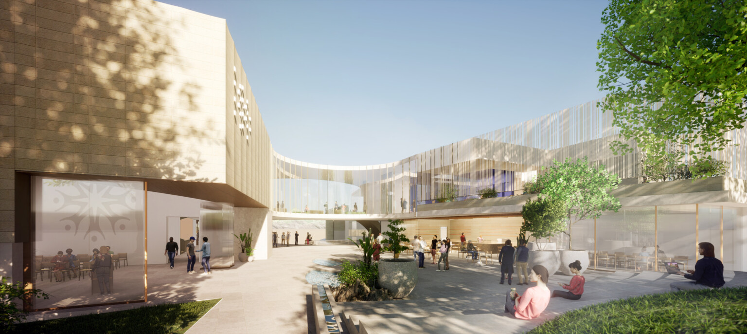
Inspired by the Earth
The use of stone gives a raw quality that is of the Earth. The stone interior begins at the lowest level, and as the material rises throughout the building, its texture smooths to a honed finish. Plaster wall finishes add movement and depth throughout the interior, distinguishing between crisp gallery walls and the textured non-gallery environments. Warm wood tones appear above grade, softening the transition from the heavily textured lower level to the delicately treated upper level that floats above the oasis. The exterior materials have a natural quality that blends seamlessly into the site to blue the boundary from oasis to building.
