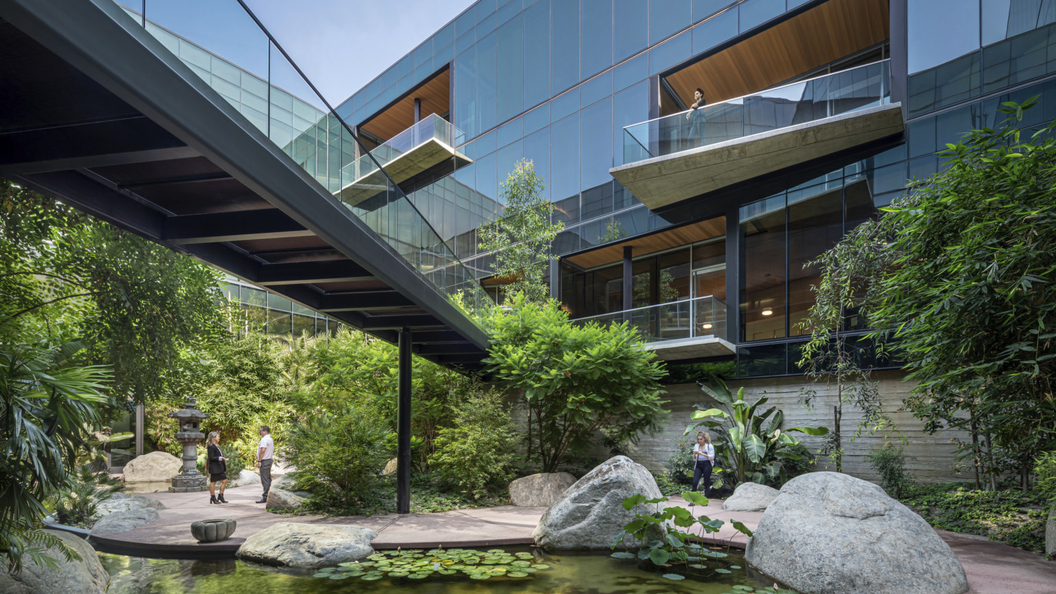
Google Kirkland Urban
A Design Focused on Community, Creativity and Collaboration
Client
Google, LLC
Project Location
Kirkland, WA
Services
Interior design, engineering
Certifications
LEED Gold
Tour the Campus
Across both buildings, a handful of anchors helped focus the multi-disciplinary team’s energy during the design process, and now drive a dynamic, engaging user experience.
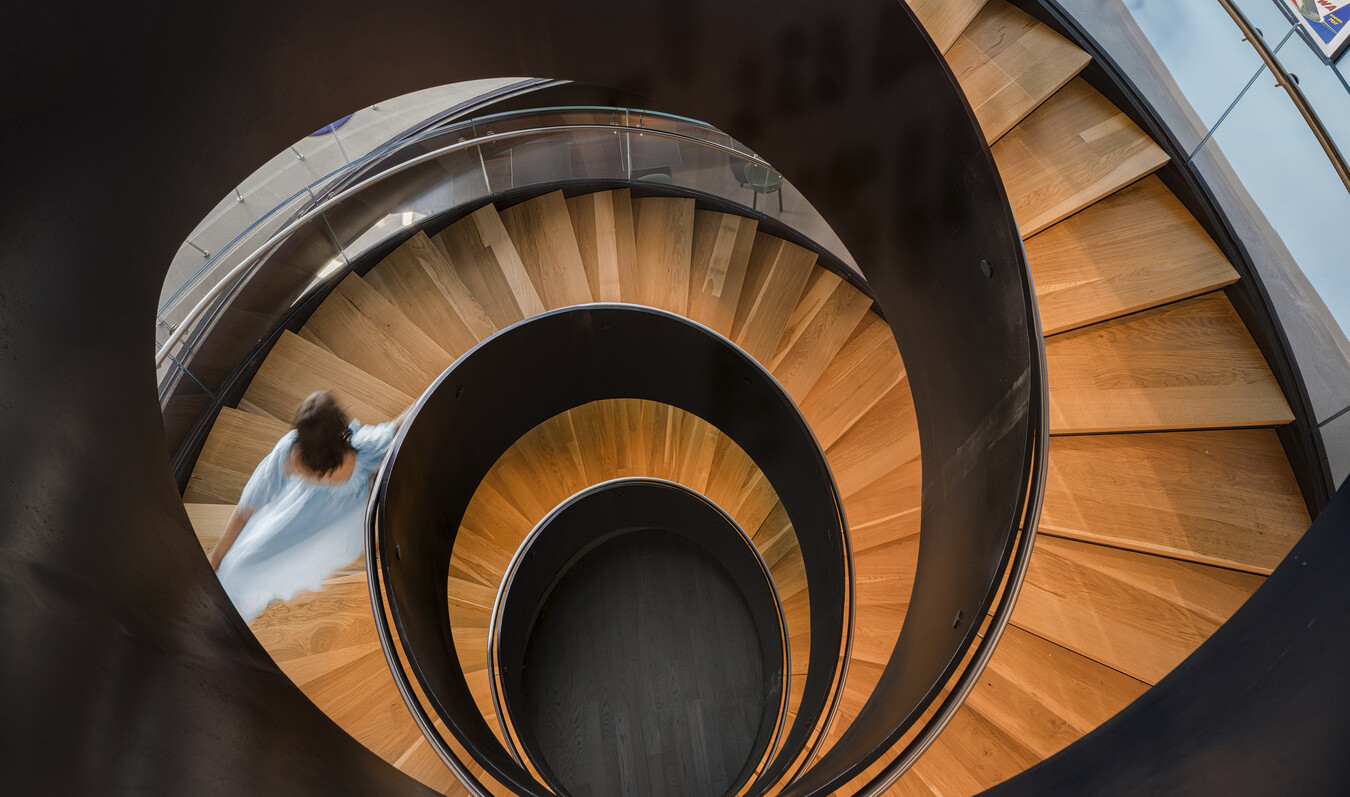
A Stairway to Heaven
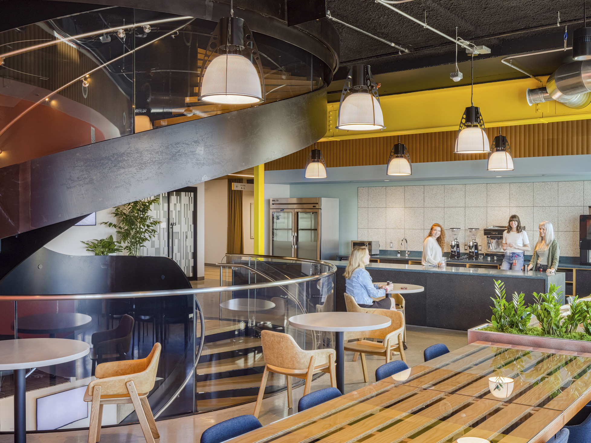
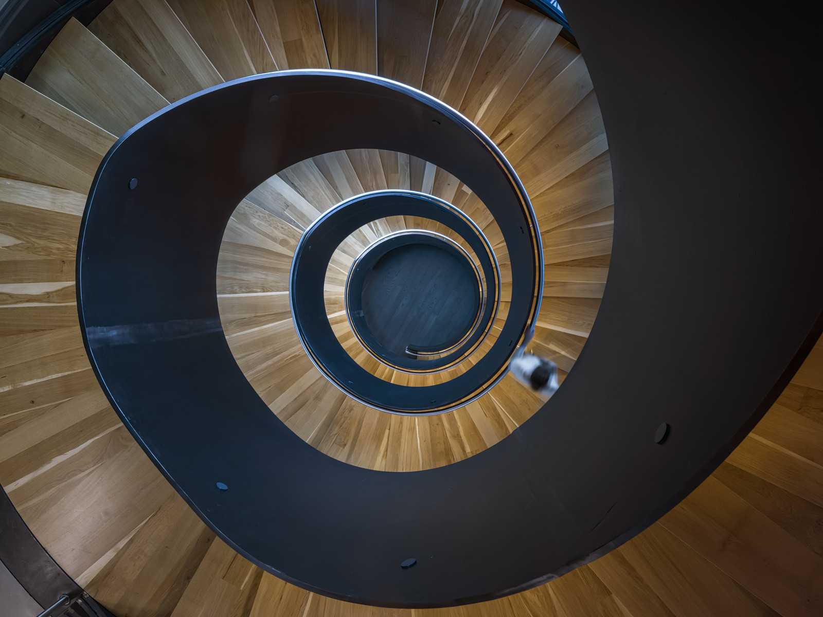
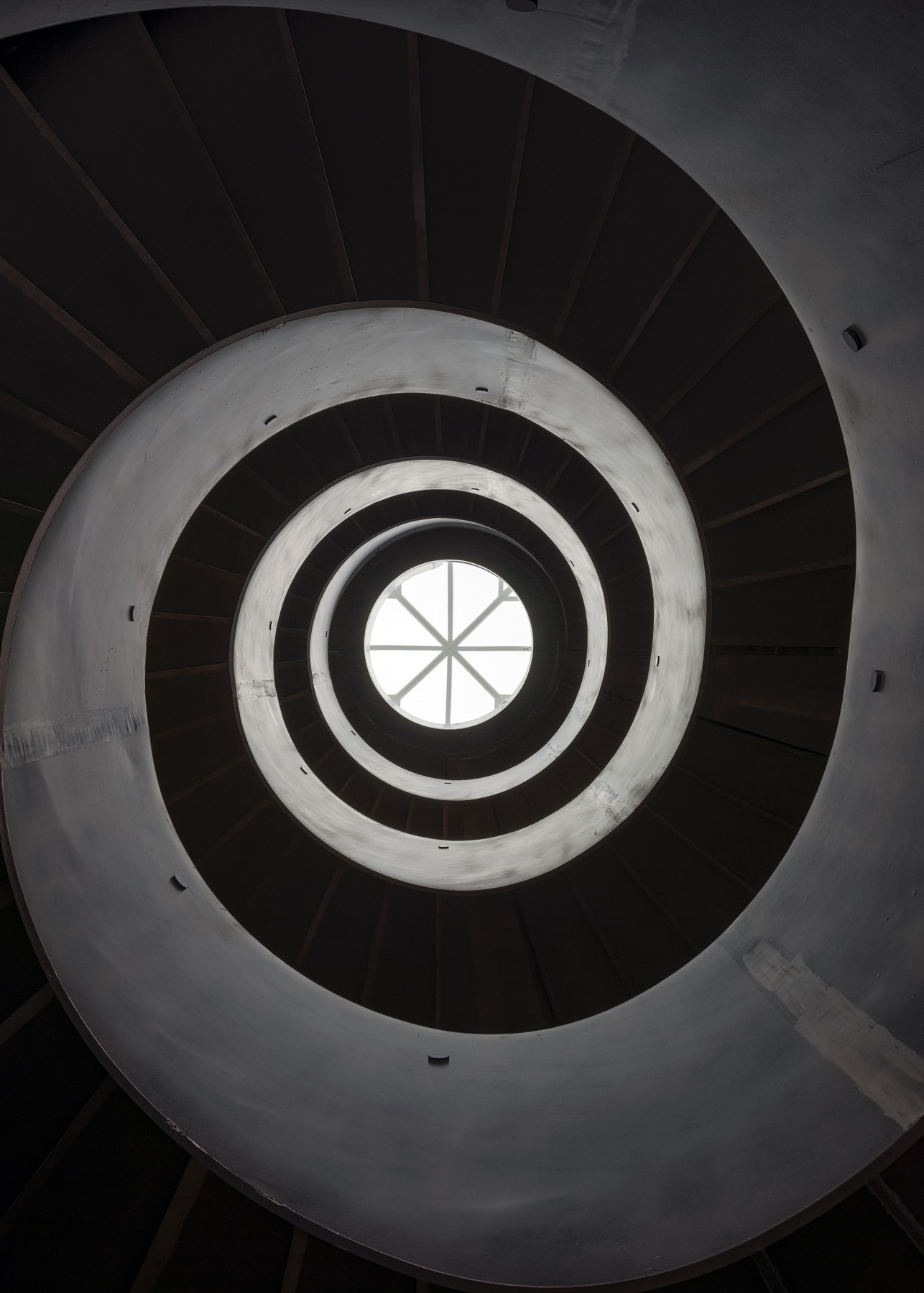
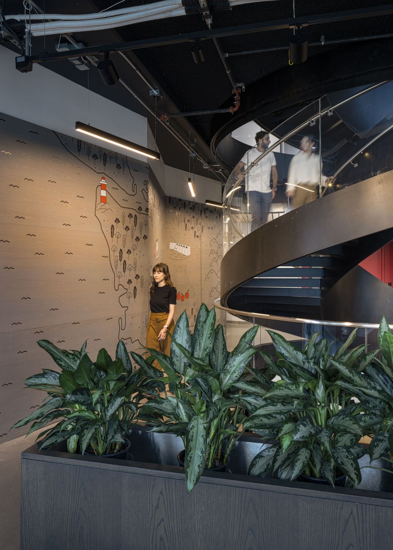
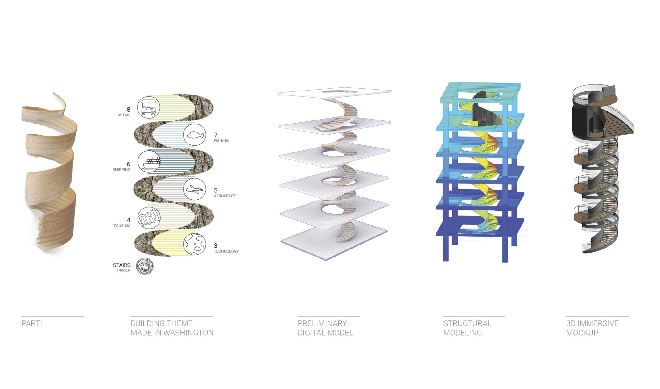
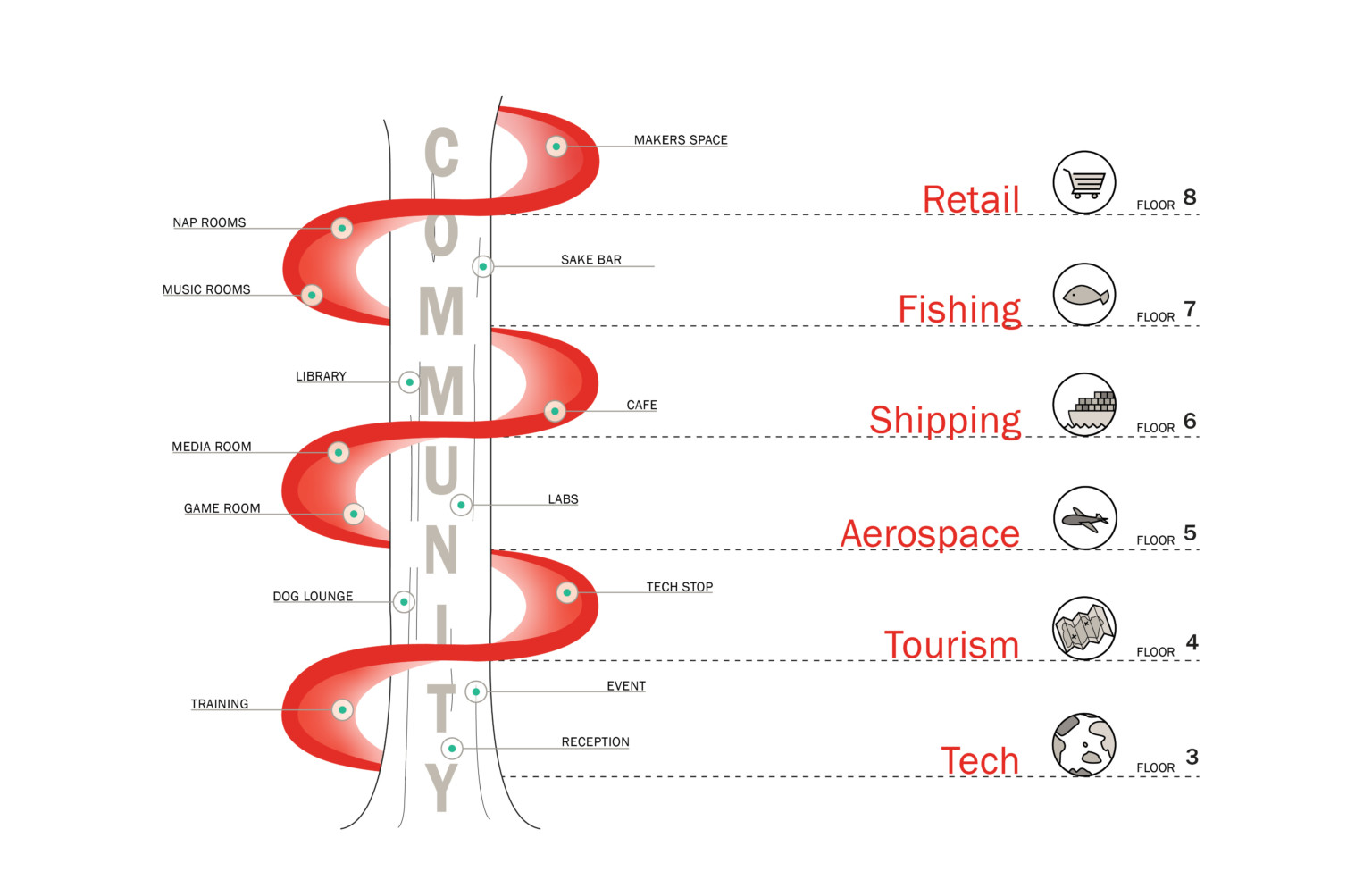
The design metaphor “Made in Washington” was inspired by user engagements where employees professed the multitude of ways they love their state. Going beyond standard landmark cues, the campus provokes deep awareness of the region’s history from industry to geology, agriculture to the arts. At Central, representations of the state’s identity stack across levels, engaging all senses along the way. Binding this progression of place is a massive, continuous six-level curved steel connecting stair. Modeled after the spiral form of a wood shaving, it ties to timber as the backbone of Washington industry.
Transformable Work Studios
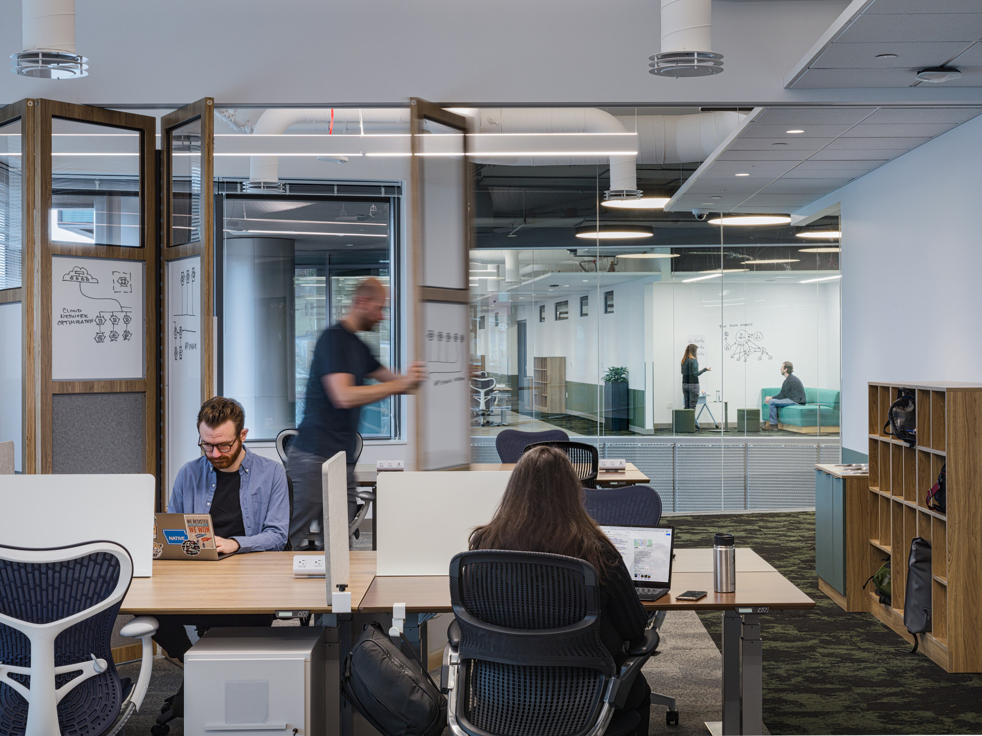
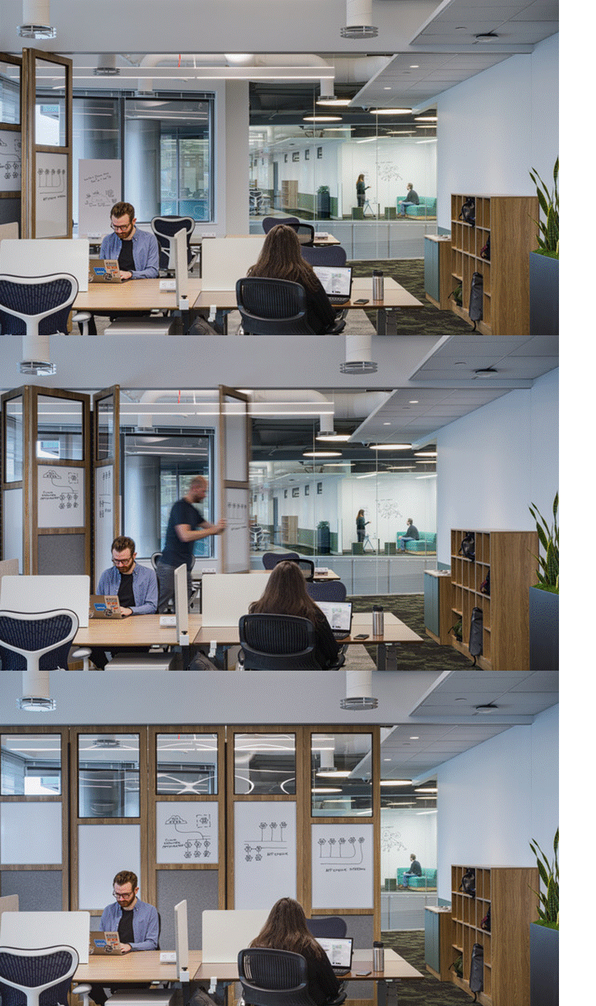
In a fast paced and evolving industry, Google needs spaces that offer agility and flexibility. At North, the design team created a custom, movable wall system. The built-from-scratch product – developed in partnership with a trusted furniture manufacturer – introduces hyper-flexibility, allowing teams to reconfigure space on the fly without needing to engage facilities or maintenance teams. This brings a space transformation cycle from two weeks to a matter of minutes. With whiteboards, acoustical felt pin-up surface, and transparency, the dynamic wall becomes a functional work surface.
The Art is in the Making
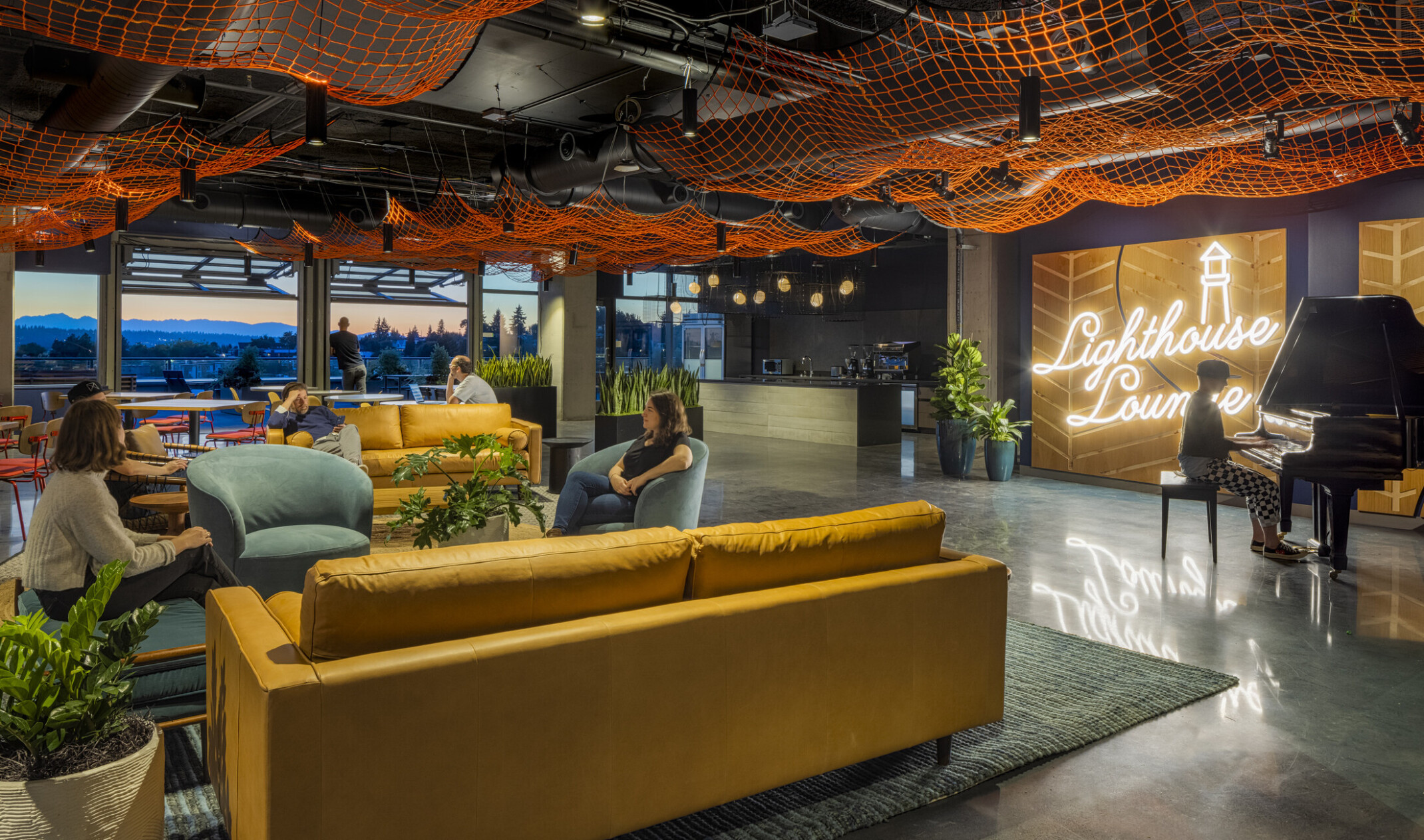
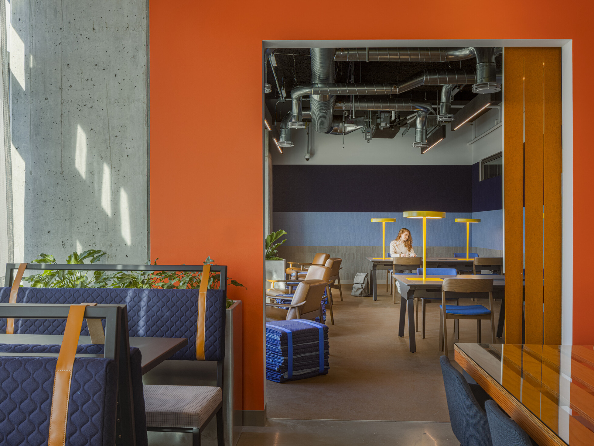
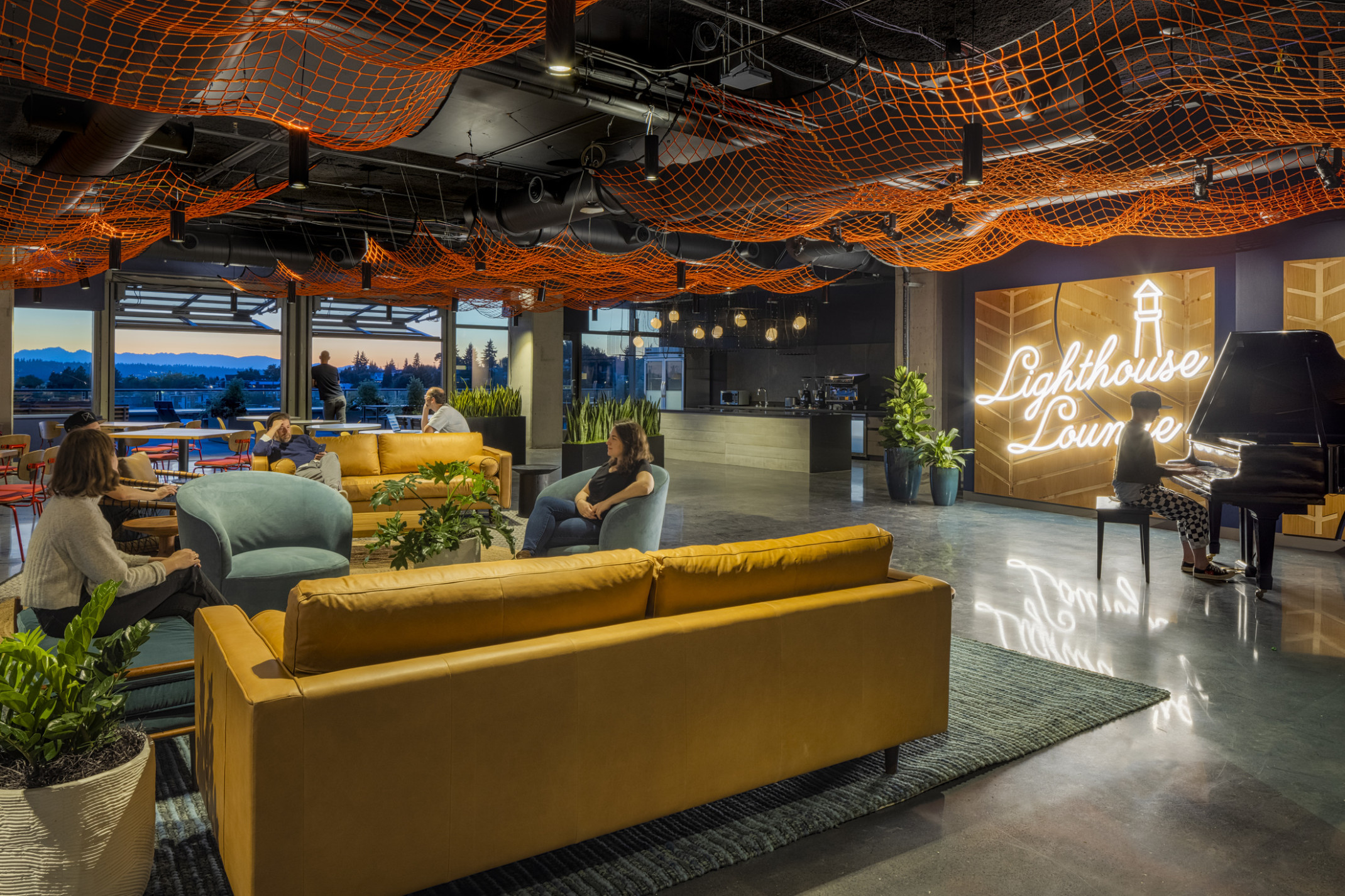
Where horizontal and vertical circulation join at the spiral, adjacent social and collaboration space is signaled with bold color, artful touches, and experiential graphics. Engaging local artists and makers brings whimsical, hands-on moments that blur the boundaries between architecture and art, while tying back to the Made in Washington metaphor. A massive commercial fishing net hangs from the ceiling on one level, while another level’s lounge sports custom wallcovering made entirely from vintage airline playing cards.
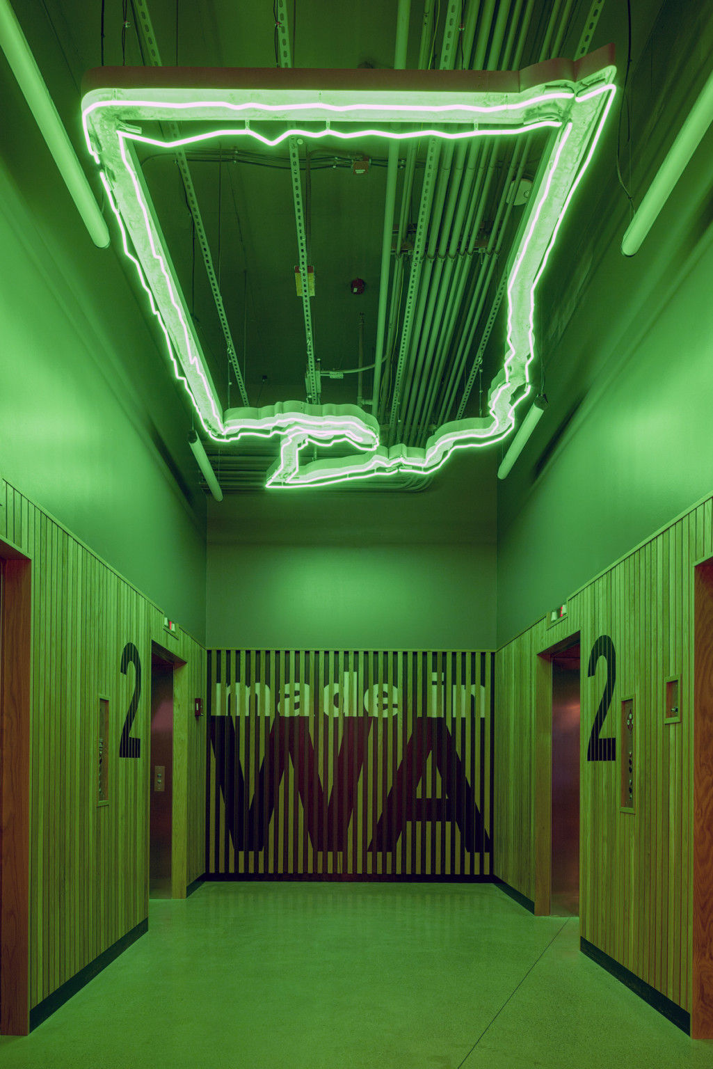
Googlers and guests are welcomed with a glimpse into the building's theme in a dramatic elevator bay, featuring custom sculptural lighting carved by Washington topography.
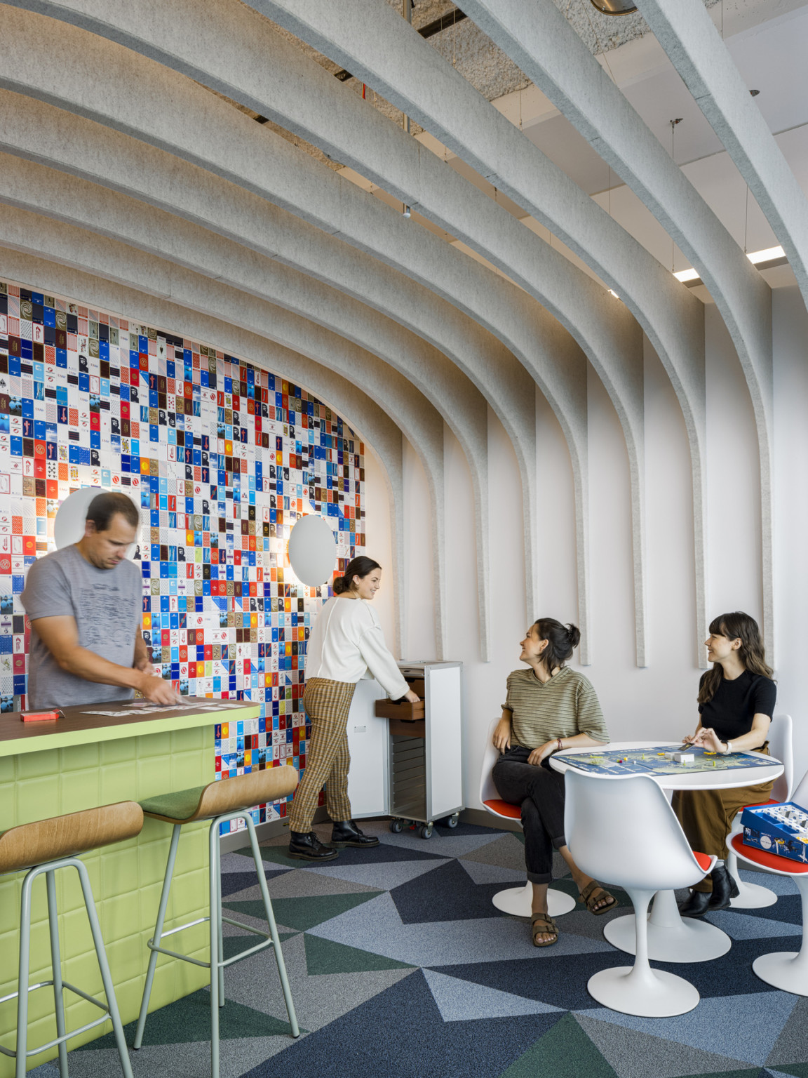
A lounge on the Aviation floor features a wall made entirely of vintage airline playing cards, and an airplane food cart repurposed as a game vault.
Verified Material Transparency
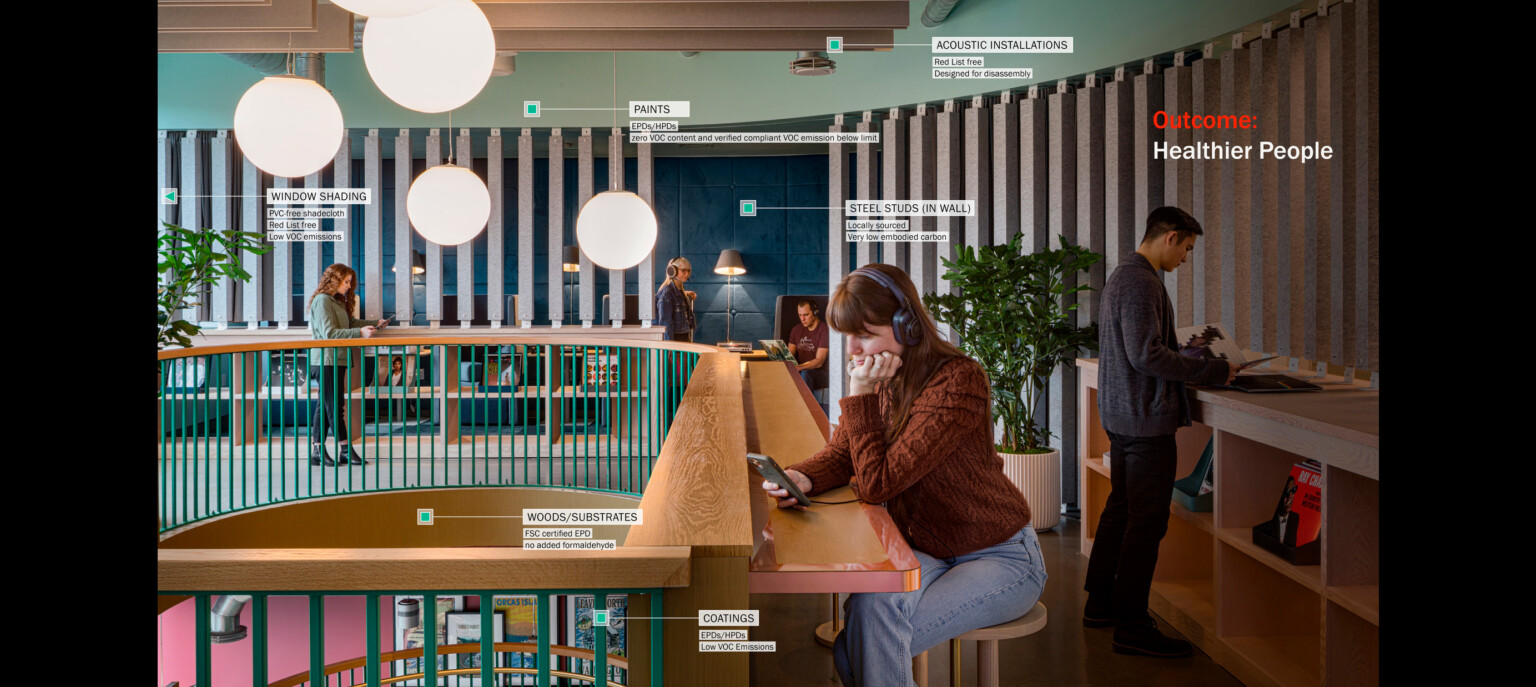
The design team worked closely with Google’s Sustainability team to achieve unprecedented levels of materials transparency related to user health, testing the feasibility of the Living Building Challenge Materials petal and making significant strides in verified materials transparency (VMT.) Inspired by consumer transparency movements in fashion and beauty, VMT tracks material cost and quantity alongside the Red List, designated as harmful to living creatures or the environment, embodied carbon, volatile organic compound emissions, and net positive waste. The project also achieves LEED Gold certification, balancing building performance measures with user comfort measures including mechanical, daylighting, LED lighting, and water systems.
