Seeing and Valuing the Patient as a Customer
What does “treating patients like customers” mean to you?
From a provider perspective, treating patients like customers means taking more time to make sure that patients understand their diagnosis and are comfortable with their treatment plan. From a design perspective, it means equipping providers with a space that patients feel comfortable being in and returning to. Most people don’t want to go to the doctor’s office – we associate clinics and hospitals with pain and discomfort – but there is a way to make visiting the doctor a seamless, dignified experience.
How does this concept manifest in the world of healthcare interior design?
Instead of approaching the design process from a purely clinical, efficiency-focused standpoint, we look at factors that will make healthcare spaces inviting, soft, and open, while still providing a comfortable level of privacy. Transparency is important. Instead of tight, claustrophobic spaces with blank white walls, we make sure that patients can see the outdoors, and have easy access to the support staff they need.
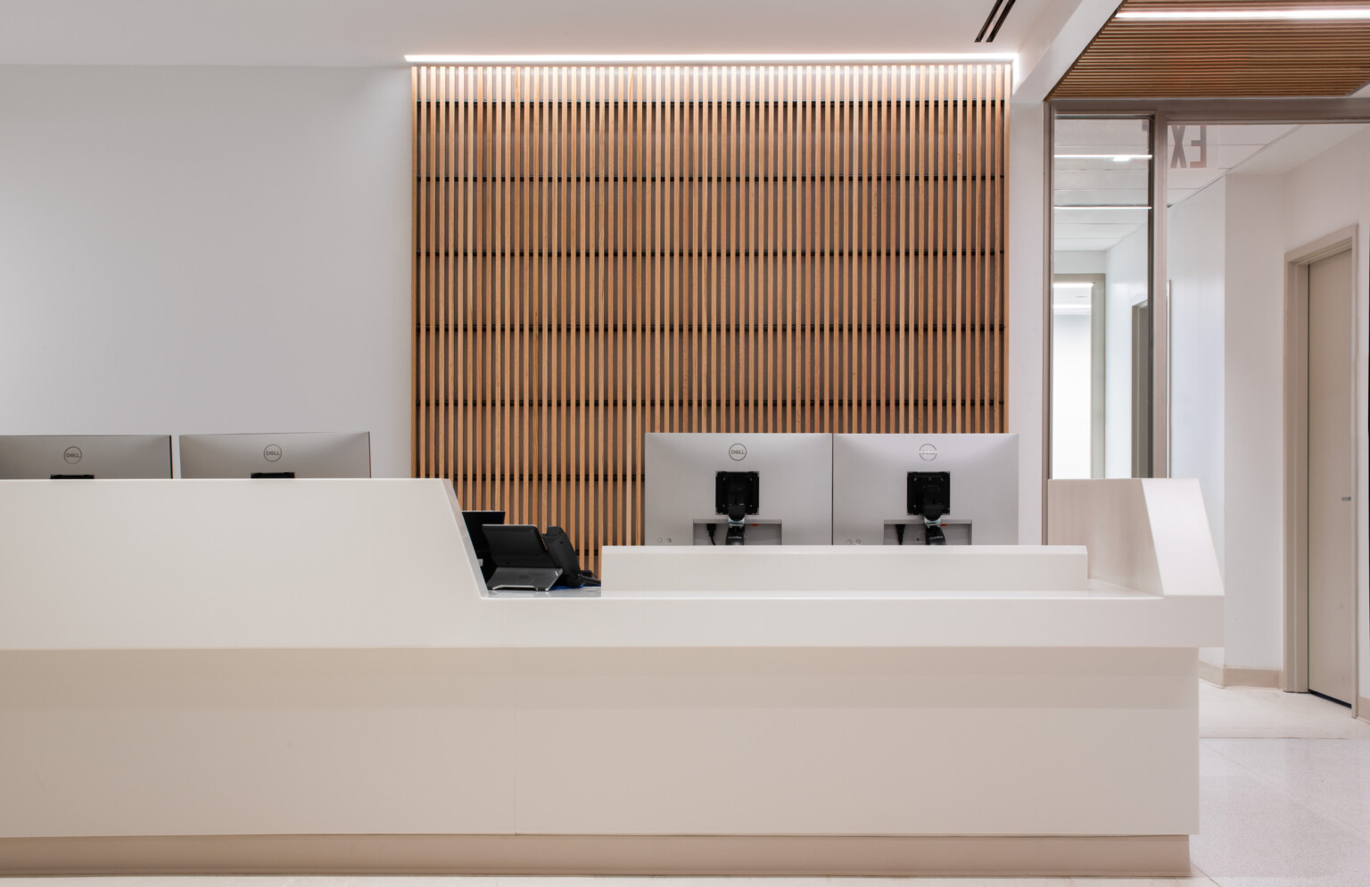
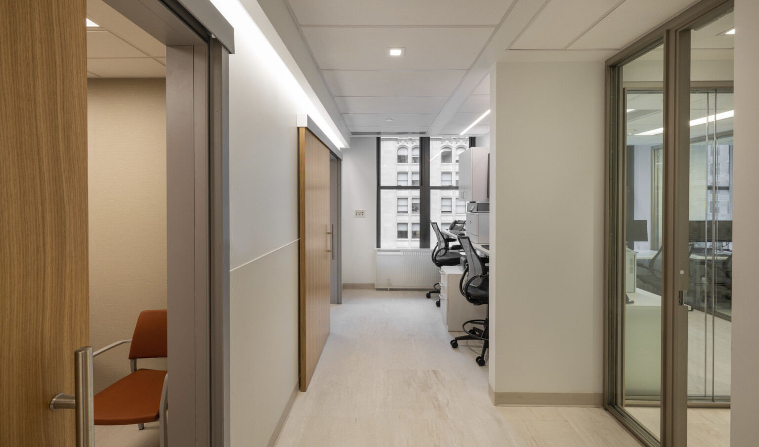
When we designed the Mount Sinai Health Systems Cardiology practice, we focused on all these elements. MSHSC is full of natural, warm, soothing tones with pops of color featured in fabrics to give a spark of life. A natural wood grain brings nature indoors. A skylight in the waiting room helps to brighten the space, and we even incorporated artificial light into the skylight to supplement daylight during the winter months.
Further, the long corridors in the clinic terminate in large windows, giving patients a view of the outside world. This provides natural light while also helping patients navigate the space. We placed staff offices on a bank of windows to make them feel larger, and we used frosted glass to separate the spaces while still maintaining transparency.
How do you design healthcare spaces that are safe for every patient but are also warm and inviting?
As we enter the design process, we start to divide the space by what can be public and what needs to be private. We focus on traffic flow and how we can create ease of use for not just patients but also providers and their teams. As we build out a circulation path, we create a series of progressive checkpoints that aren’t necessarily a wall or division of space – this could be an open space with a person available to monitor the area or incorporate screening that doesn’t have the same visually separating effect as an opaque wall.
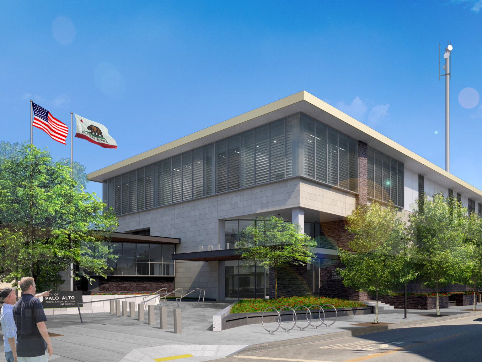
One important safety consideration is to prioritize complete visibility of who is approaching the building. To increase security, some clients request ballistic glass, specific alarm systems, or camera systems, and we can incorporate all these safety systems in ways that don’t disrupt the building’s aesthetics. With today’s technology, we have a lot of options for durable materials that are still beautiful. We focus on these options as well as natural materials to bring warmth and biophilia.
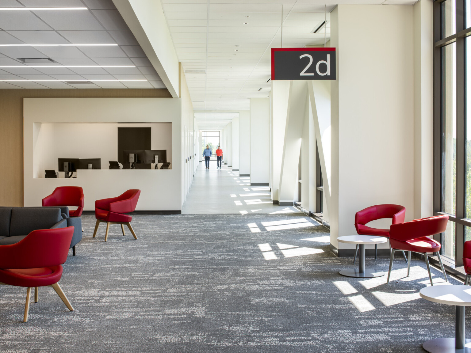
Once people enter the building, they should immediately see where they need to go next. We’ve all had the anxiety of entering a new space and being unsure about where you’re supposed to go – if we can resolve that, we’ve addressed another situation that adds anxiety to the patient experience.
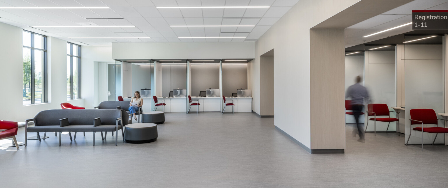
In our project with The Ohio State University Wexner Medical Center, we designed an outpatient care facility with simple circulation. By incorporating clear signage and spaces for staff to be stationed throughout, patients can navigate easily.
How do you balance the need for safety and privacy with aesthetic considerations?
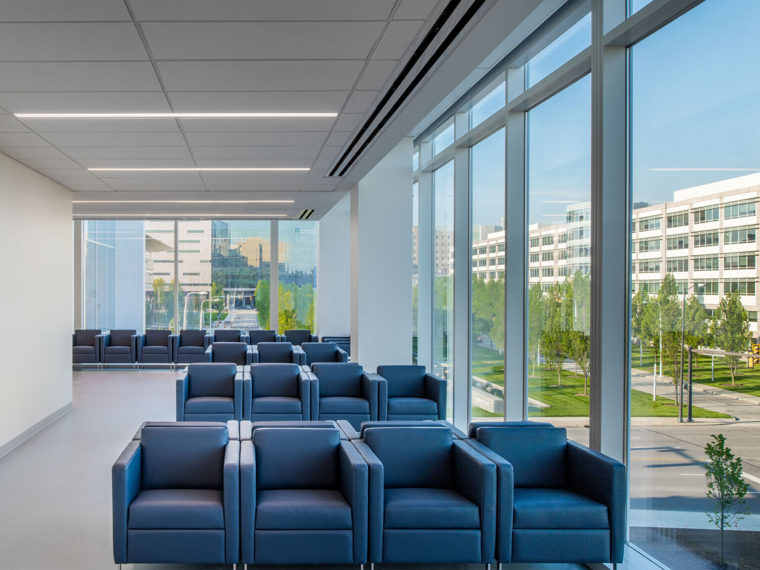
The challenge in designing private spaces in a healthcare setting is creating privacy while not making patients feel blocked in or isolated from the rest of the world. We provide more transparency, openness, and that feeling of relief one gets when you can see outside. A beautiful view can make a medical space feel much more relaxing.
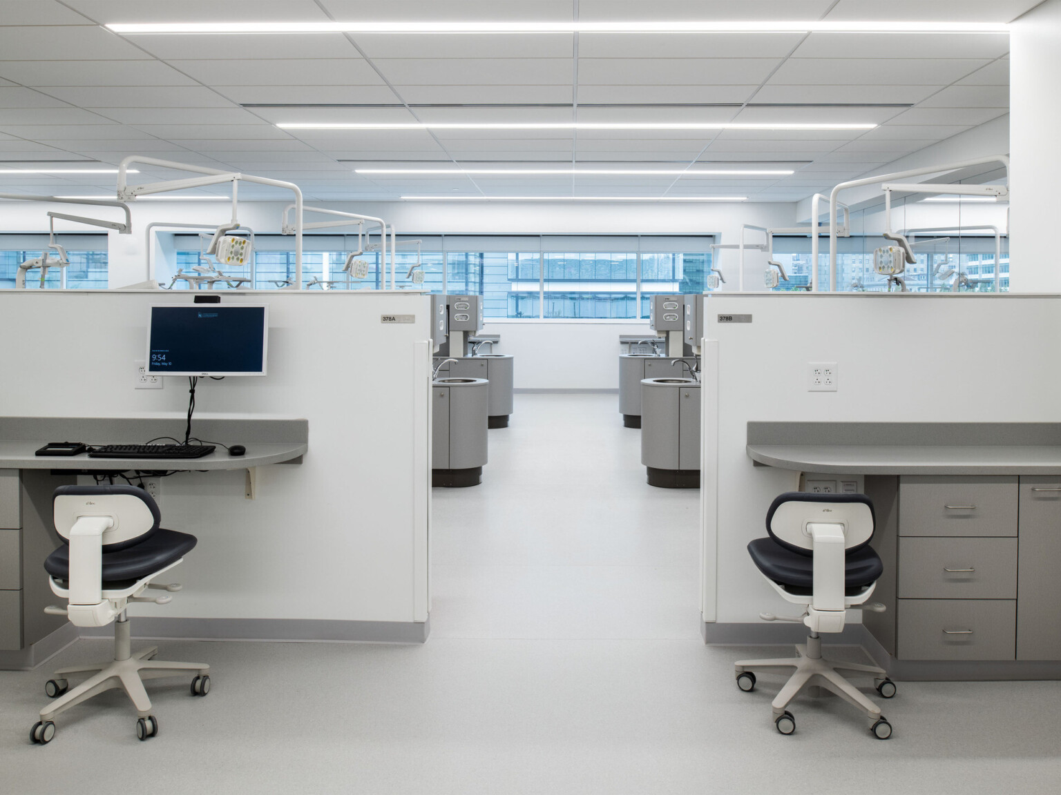
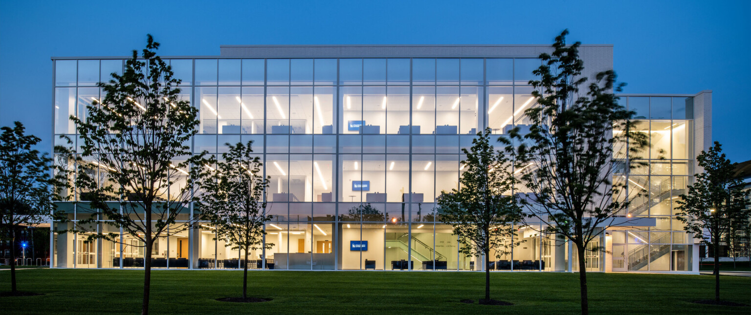
When we designed the Case Western Reserve University School of Dental Medicine, we wrapped the building in windows to provide patients and staff with a view to the outside from almost every spot in the building. The abundant natural light also helps orient providers who may work long hours performing surgery or studying.
Certain design elements offer varying levels of opacity, which we can use to adjust the level of privacy needed in different spots around a clinic or hospital.
What design elements do you use to lessen the anxiety inherent in visiting a doctor or having a procedure?
We carefully choose elements like color, finishes, and lighting to help address sources of anxiety. During the design process, I place myself in the patient’s shoes to see what they will do on their visit and find the areas we need to focus on. For example, when designing a dentists’ office, patients will be in a chair, reclined, staring up at the ceiling. In this scenario, we want to light the room and the patient without beaming glaring light directly into the patient’s eyes.
When envisioning a space from the patients’ perspective, we need to think about wayfinding. Like I mentioned before, it can be very anxiety-inducing to enter a space and not know where to go. We want a simple, direct circulation path that can get a patient from point A to point B without having to navigate a maze.
The ambient noises of a hospital or clinic can also cause us anxiety, even if we don’t consciously recognize it. While the gentle buzz of human interaction can be calming, sometimes this is combined with an alarm ringing, equipment beeping, lights buzzing, televisions blaring, and sometimes even the noises of patients in pain. We control the level of volume in a space through acoustic design, which involves incorporating elements like the correct specifications for floors, ceiling tiles, or doors and windows.
One of my personal pet peeves in healthcare facilities is visual clutter – think papers everywhere, too many signs pointing in different directions, equipment where it’s not supposed to be. I make sure that there is a place for every educational pamphlet and a home for every piece of equipment – an organized space makes both patients and staff feel more relaxed and comfortable. An organized office builds trust between provider and patient.
Since buildings can outlast individual doctors, provider groups, or even healthcare institutions, how do you incorporate flexibility and adaptability for a future in which a facility might be used for a different purpose?
If a space is well designed, it doesn’t matter who is inside it. A strong design should accommodate a variety of needs. Personalization is typically easy to adjust as branding usually comes down to cosmetic changes like paint colors, fabric choices or signage.
We do, however, need to stay conscious of the fact that technology is constantly and rapidly changing. We try to allow as much flexibility as possible so that as technology changes, healthcare spaces can adjust to the needs of changing equipment and computers.
We also try to future-proof spaces so that they can be easily convertible. We can build in the utilities for a future need – think, current consult rooms might one day become an exam room – while still maintaining that day-one function. For example, we’ve completed a project for a group that knew that they wanted an MRI machine in the future, but they didn’t have one yet. We created a shelled space with the appropriate utilities and a place where they could demolish a wall to get the machine inside the building.
Healthcare facilities, unlike traditional consumer-focused environments like a restaurant or retail store, are designed to last for decades. While a retail store may be designed to last five years, a clinic may be designed to last for thirty to fifty years. We want to make sure we incorporate durable materials that will still look new after years of use.

