Bringing Project Stories to Iconic Graphic Status
Inspiration to Become a Designer
Much like every child, I loved to express myself creatively through drawing. I think I stuck with it because it was nurtured and encouraged by my parents at a young age. I believe the ability to create is something we all innately have.
I went to high school in the Bahamas which follows the British education system and allows an individual to focus on a field of study. I went into sciences; I kind of left drawing alone. But in college, it came back to me. So, I went to college for visual communications.
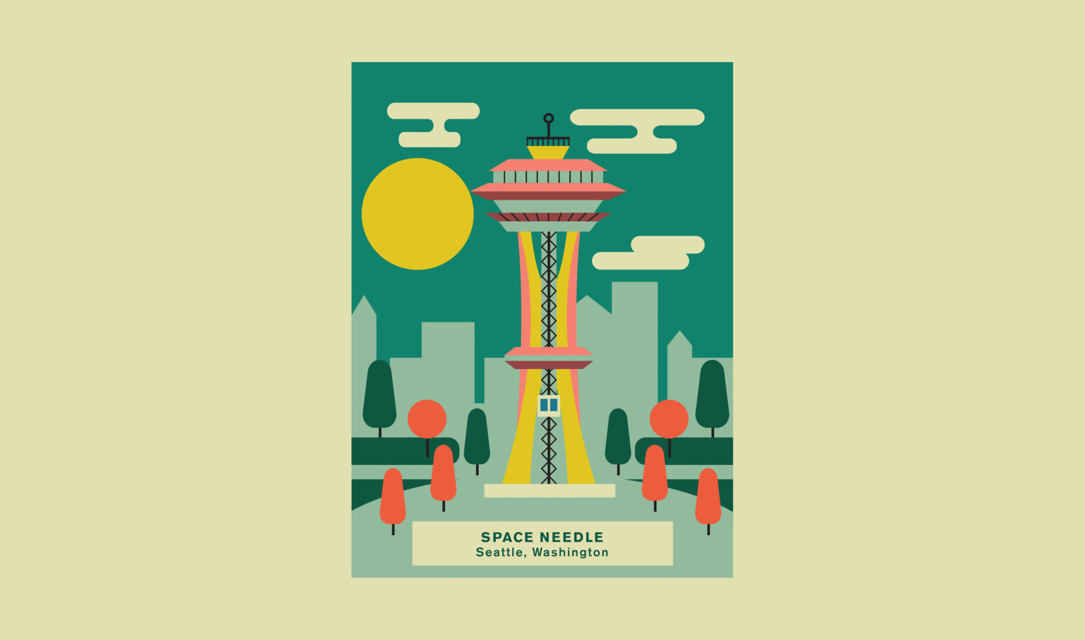
We All Have the Ability to Create
I have a 3-year-old daughter, and it’s been fascinating to see the things that kids can do. In some cases, it’s all over the place and abstract, but it’s also a way for them to kind of express themselves. As they grow older, you see it change very rapidly. When my daughter was 2 years old, it was just marks. At 3, there are distinctions like faces and people, then rainbows and butterflies. It’s very deliberate now. I think everyone initially can draw. It boils down to how much attention you pay to it.
Learn more about the Mall of America.
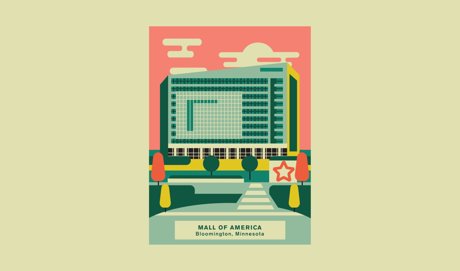
Art and Design: Two Sides of the Same Coin
I went to school in Kearney, Nebraska at the University of Nebraska Kearney and my experience there helped develop my love for design. My initial design experience occurred in the 10th grade; I entered a contest to design a hot sauce label and won. In the Bahamas, everyone loves hot sauce – but I wasn’t paying attention to art and design as separate disciplines at that time. I just liked to draw.
The Inspiration for the Poster Series
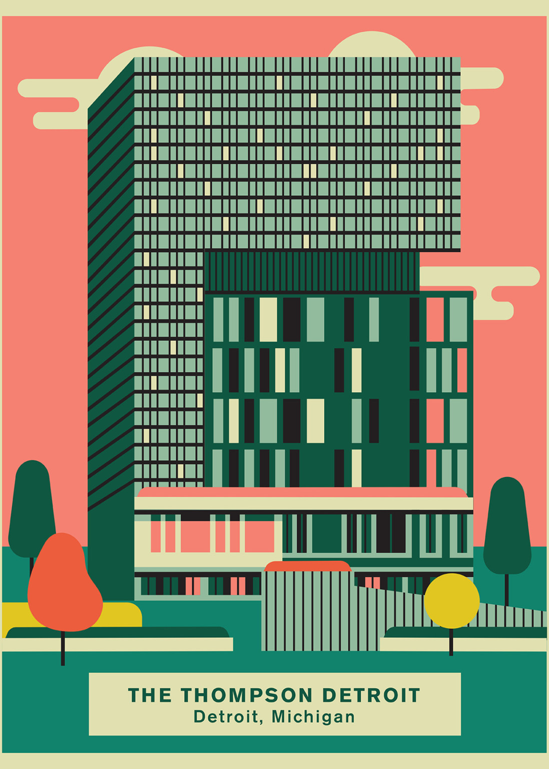
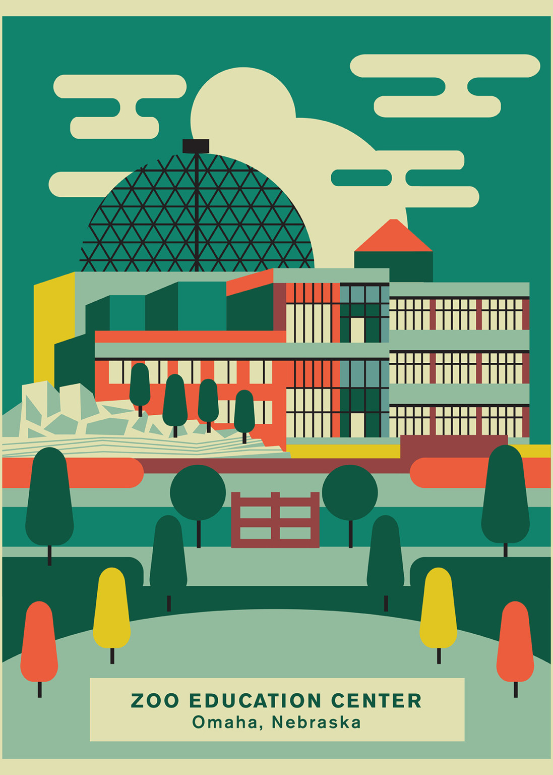
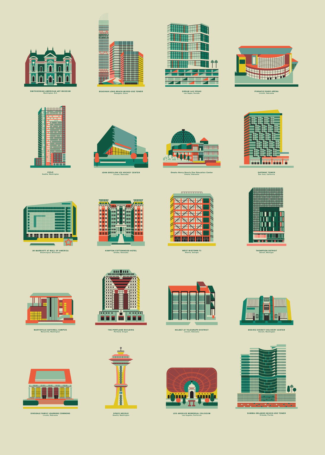
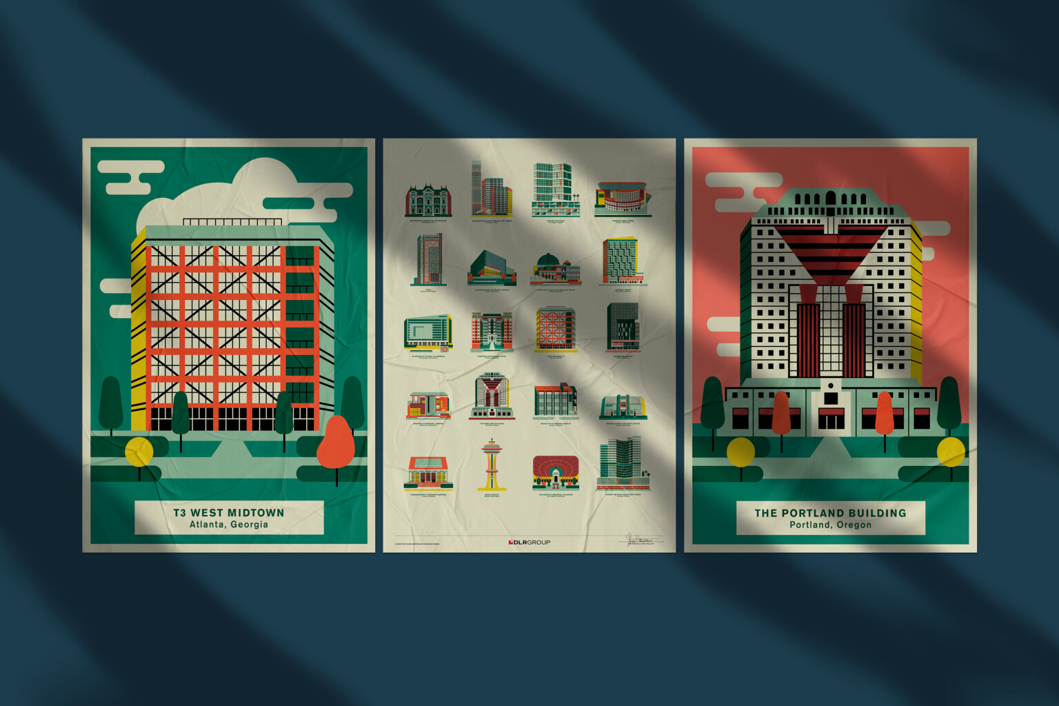
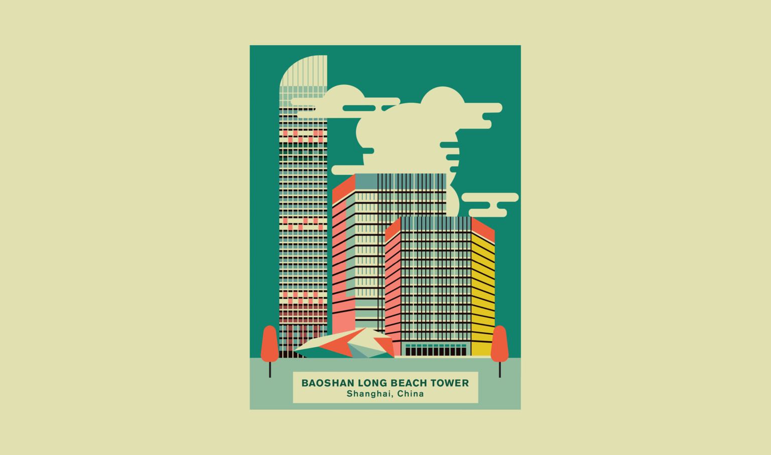
The inspiration comes from architecture and all those elements that visually comprise a building. One building, for example, can be constructed out of many geometric shapes but they all come together to form a whole structure – kind of like architecture. So, all these elements are basic shapes constructed and arranged in such a way that they form recognizable buildings.
Learn more about Baoshan Long Beach Tower.
Design Process
The process began by taking these simple geometric shapes and using them to form the capital building in Lincoln, Nebraska. The first concept was kind of off a bit. I did it in a couple of different styles before I eventually landed on the current direction, which became like mini-icons of the buildings. This direction is more marketable and relatable. I can do multiple buildings in that same style: pretty simple, iconic, and it’s almost like a symbol of that building.
I initially started in black and white and then I decided to add color for added depth. And also with that, I wanted to make it a little more abstract too, because now I have color to use. I can make it abstract and still recognizable. I think abstraction adds to the interest of it too, making it look almost three-dimensional but it’s still flat. There’s this odd perspective to some of the buildings in the series, yet you can still make it out.
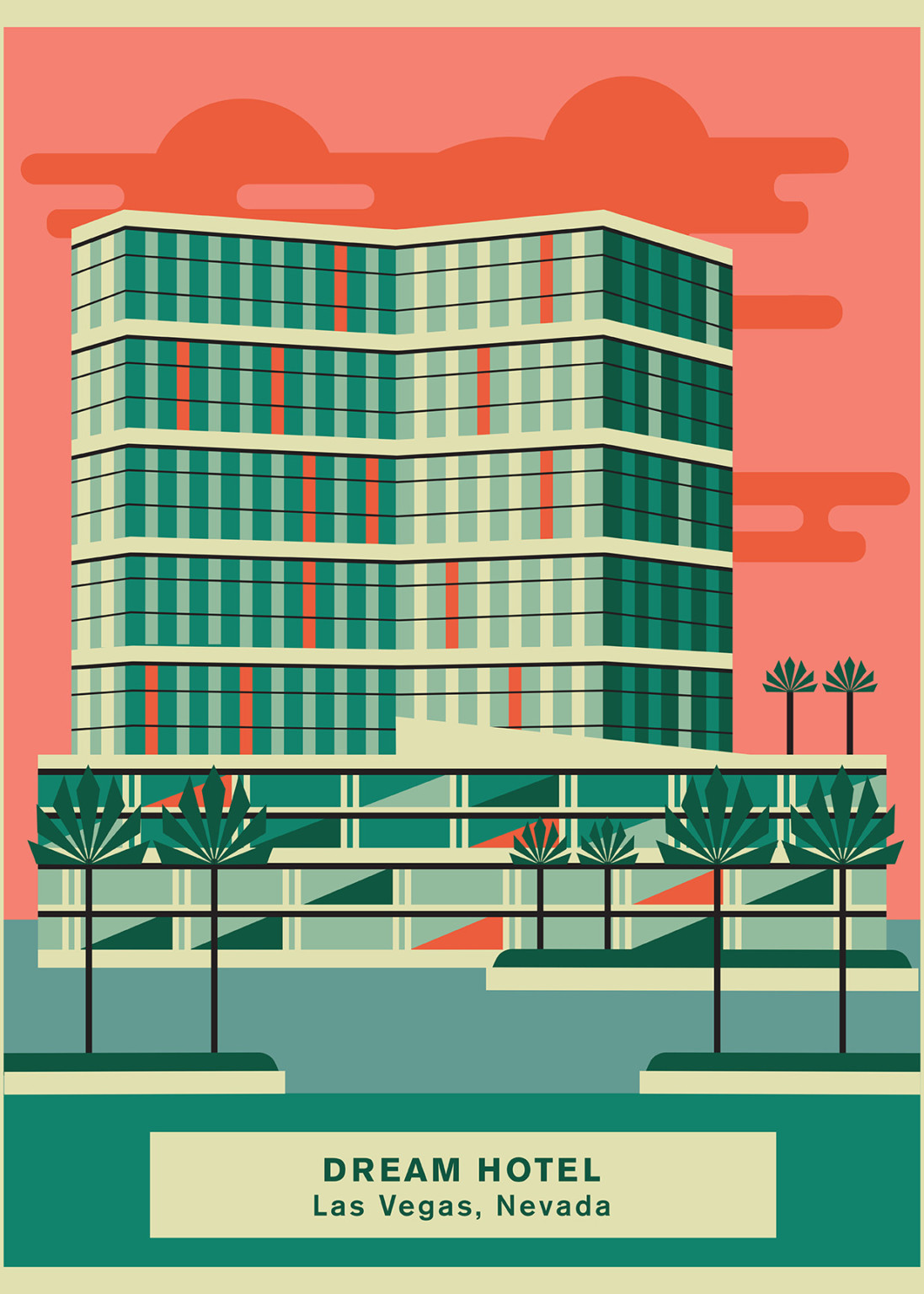
From brand development to experiential graphics, from installations to wayfinding and signage our award-winning experiential graphic design studio has worked with Fortune 500 companies, collegiate and professional sports clients, education, boutique start-ups, and everything in between. And sometimes, we even get to be our own clients and celebrate design excellence.
Click to expand the full experience with sound:
Learn more about our XGD practice.
To receive ideas like this directly to your inbox, subscribe to our email list.


